Many historical buildings are known for their ornate decoration and grand statements. Some are impressive in other ways.
Chicago's Monadnock Building, the tallest load bearing brick building ever constructed, is famous for rejecting ornamentation in favour of practicality.
And whilst the architectural approach of this American building could be seen as down to earth, its size is anything but.
Here's everything you need to know about this one-of-a-kind office block.
Need inspiration?What is it?
The Monadnock Building is a 16-story skyscraper at 53 west Jackson Boulevard in the Loop business district of Chicago.
The building is made of two parts that were built a couple of years apart. The North side of the building was completed in 1891 by the firm Burnham and Root whilst the south side was added a couple of years later by another firm, Holabird and Roche.
It's been used as offices since its construction in 1891 - and is still used by businesses today
As a result of this, the two tall buildings are slightly different in their physical appearance, but the overall structure is a tall, narrow block.
The name itself comes from a term used by American geographers to describe a 'rocky mass' -- which is an apt descriptor of the building's visual appearance.
It's been used as offices since its construction and is still used by companies today, as well as being a distinct architectural landmark in Chicago.
It's one of Chicago's earliest skyscrapers along with other buildings situated nearby including The Manhattan building, The Old Colony Building and The Fisher Building.
In the Loop
The building was first commissioned by developers in the area now known as The Loop business district, between the Chicago River and Lake Michigan.
It was considered an odd move to build there, in what was largely rough land with little more than shacks for company.
The design itself also faced criticism, largely for its puritanical and functional aesthetic. Some felt the lack of ornamentation, particularly in the North side, was a sign of heartless commercial purposes. Indeed, Holabird and Roche, the firm that built the south side, apparently took this criticism seriously and added far more ornamentation to their part of the building.
The building avoided demolition during turbulent times and periods of high maintenance by remodelling and modernising the office spaces, lobby and more.
It was sold a few times in the second half of the 20th century, each time being modernised or restored. The biggest restoration project took place in 1979, bringing it back aesthetically to its original condition.

Unified design
Whilst the design was criticised at the time, it would ultimately prove influential and come to be seen as 'a triumph of unified design'. One critic called it 'one of the most exciting aesthetic experiences America's commercial architecture produced.'
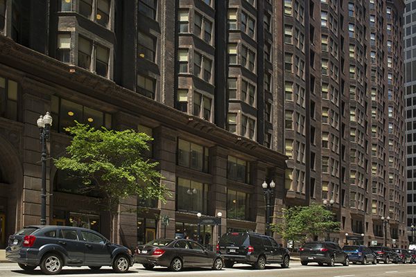
The building is essentially a vertical mass of purple-brown brick but flares out slightly at the base with those bay windows providing extra shape. Designed by celebrated Chicago School architect John Wellborn Root, the North side curves out slightly at the top and the South side has a copper parapet which runs all the way round. The corners of the building are chamfered, providing one of several small features which make for a distinguished structure.
Although at first glance it is a giant block, the consistent and extensive use of glass in the windows which cover the building distract from this. The windows combined with how narrow it is mean that all offices in the building also get decent exposure to light.
Skylights bring light to the open stairwells which were themselves notable for being the first structural use of aluminium in building construction.
Of the many things said about the building, one description from the time communicates its unique appearance; 'Stripped of every vestige of ornament, its rigorous geometry softened only by the slight inward curve of the wall at the top of the first story, the outward flare of the parapet, and the progressive rounding of the corners from bottom to top, subtly proportioned and scaled, the Monadnock is a severe yet powerfully expressive Composition in horizontal and vertical lines.'
The style would go on to inspire what's known as the 'Chicago-school' style of architecture.
What about the bricks?
One thing is for sure, this is a proper brick building. That it has lasted throughout the 20th century and beyond is partly thanks to the sheer durability and reliability of brick as a building material.
Traditional load bearing walls are almost non-existent in modern construction and even by the second half of this building's construction it was being phased out as a building technique, with steel frames used for load bearing.
You see it's only really the North side of the building that can hold the title of tallest load-bearing brick building. By the time they built the south side, reinforced steel was becoming more accessible and steel frames more widely used in construction.
The building is a case study in the transition between these different styles of construction. Brick still played an important part, but it wasn't relied upon to transfer the load from roof to foundation.
It's unclear what bricks were used in the building, but they retain the imposing brown-ish aesthetic that can still be seen by passers-by today. Similar styles of brick might include the Acera brick or Autumn Brown. Find similar bricks here.
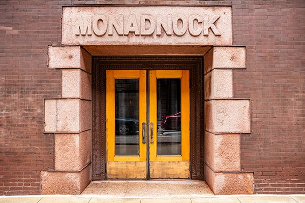
As well as brick a large amount of stone was used, including a substantial granite base which supports the building's full weight. There are also the red granite lintels over the entrances and the copper cornice on the roof.

Architectural landmark
The Monadnock building was made a Chicago architectural landmark in 1958 and named a part of the historic printing house district in 1976.
It still operates as a fully functioning office building today for private companies as well as offering tours.
With a lot of architecture today designed around sustainability, you could say the Monadnock, with its practicality and minimalism, serves as inspiration, getting to the point and making optimal use of the space available.
This building has also stood tall for 130 years and counting, a testament to the quality of the building materials used! Whilst relying on load bearing brick masonry might be a thing of the past, the bricks themselves are unlikely to go out of style any time soon.
We're here for you
If you're inspired by The Monadnock Building's groundbreaking design, but can't decide which bricks to use, our free Brick Selection service could be just what you need; if you want to use bricks that blend seamlessly with the rest of your home, our Brick Matching service could be right up your street; or if you'd prefer to browse bricks for yourself, we have more than 3,800 products to choose from in our Brick Library!
Our expert Brick Advisors are standing by to help you figure out how many bricks you need for your project, then source them and find you the best price - we'll even arrange delivery too!


